For this week’s form and content exercise I decided to continue with finding World Wildlife Foundation Advertisements. I found this advertisement on http://www.webalice.it/edmtromb/blog/big/stop_global_warming_big3.jpg The context that this advertisement shows is that if we as humans continue to waste energy, then the wildlife animals will lose their home, and will have no choice but to live in our habitat. The connection between the content and the form is that the text says that these animals are losing their homes and if we as humans can help they can keep their home, and the form is a seal on a city bench with no home, and he is definitely in the wrong habitat, and even though the seal is in our habitat he is still homeless. What makes this advertisement visually interesting is that most of the picture is a gray tone just like the seal that is the main focus of the picture. Also since the picture is in a gray tone it makes the message stand out. Some principles of design are used in this advertisement, one is balance, it’s mostly balanced, but the advertisement seems to be a bit right heavy. With proportion it seems a bit off because the seal looks too small as if the designer shrunk the seal to make the seal fit the city bench. The advertisement also uses rhythm, for example, the bricks of the building. Another principle of design used is emphasis, for example the highlights on the seal, also putting the seal in the middle of the advertisement. The type relates to the image because when the ad mentions to stop global warming, it’s in red and it stands out, while the rest of the image in a gray tone. But, I believe that the type on the bottom of the advertisement should be a bit bigger, because the message is important but it’s hard to read.
Thursday, April 23, 2009
Form and Content Exercise 6
Thursday, April 2, 2009
Form and Content Exercise 5
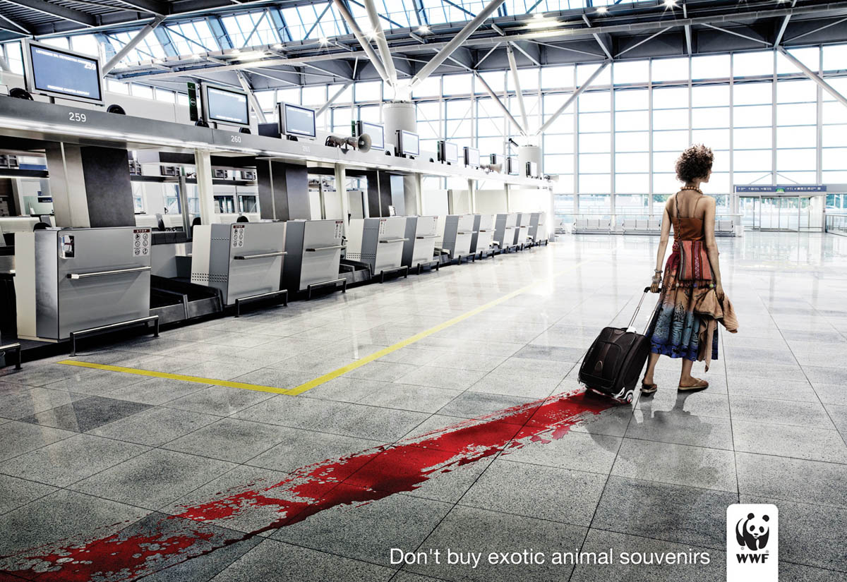
For this week’s form and content exercise I choose another WWF, World Wildlife Foundation print advertisement. I found this print advertisement on google. com when I searched for WWF print ads. The context that the ad presents is simple don’t spend your money on items that these endangered animals lost their lives for when you go on vacation. Even though you didn’t kill that animal, you payed the people who killed that animal and you payed the people that sold that product to you, so the blood is also on your hands. The connection between the content and the form is the text simply states don’t buy animal souvenirs on vacation. The photograph shows a woman who is coming back from vacation, clearly buying animal souvenirs, the product is in her suitcase, and the first thing you see when killing an animal is its blood, so that blood will always follow her. What makes this print advertisement visually interesting is I looked at the photograph and the blood and got confused until I read the bottom of the ad, “Don’t Buy Exotic Animal Souvenirs,” and I thought that, that was totally wrong. But the WWF did what they were set out to do, to shock the public, and to let the public know that this cruelty still exists, and is still going on today. The WWF wants people to help by, refusing to buy anything to do with animal products that those animals unwillingly gave their life for. In the ad there is really no balance it seems very left heavy. There is proportion in the ad, the airport is big in scale, and the person is small in scale, but there is depth of field, closer to the front of the ad everything is bigger but as you move forward in the ad the doors to the airport are small. In the ad there is evidence of rhythm, for example, the monitors, tiles on the floor, and the windows are in a continuous pattern. The type relates to the image by making it simple, just like the airport, there’s no one to be seen but the woman. Also the type catches the eye just like the blood on the floor.http://www.ibelieveinadv.com/commons/wwfblood.jpg
Friday, March 6, 2009
Form and Content 4
For this week’s form and content I searched online and found a very creative print ad from the World Wildlife Foundation. I found this ad at http://images.google.com/imgres?imgurl=https://blogger.googleusercontent.com/img/b/R29vZ2xl/AVvXsEig0VzEMhO2I_ZiYHIACeJ6DHdZOx-uU3I7mn5gPfdAG7QcMELaKMq8WAxYNYgXmHhfx2Sh0RxsjO_yQoJKQCxYYmGnZ8TThP20Z_wtbpjFXcKvv4Mx4ZfCFmIRl3DKESkvT4kFE7wkmaI/s400/o_wwf-giraffe-gr.jpg&imgrefurl=http://thebests-ads.blogspot.com/2008/09/wwf-coins.html&usg=__fWzBfXry-imFM78GH88Ju2FseYc=&h=283&w=400&sz=26&hl=en&start=6&um=1&tbnid=oU55hg6APr_p9M:&tbnh=88&tbnw=124&prev=/images%3Fq%3DWWF%2Bads%26hl%3Den%26sa%3DN%26um%3D1 . The ad shows a Giraffe created completely out of pennies, and the background looks like its set in Africa. The context that is used in this ad is simple the ad is for the World Wildlife Foundation. The connection between the content and the form is that the giraffe is made out of coins, and the message is plain and simple, that any kind of donation helps even if its cents and it could go towards giraffes. What makes this ad visually interesting is how they made that giraffe completely out of coins, it didn’t even confuse me. Also that the giraffe is the main focal point, not the text it is a simple idea that worked. It seems that the World Wildlife Foundation wanted to make a point by making the animal the main focus over the text, because even though the text is small my eye was drawn to it right after I saw the giraffe. One principle of design that the Foundation used was balance, when you look at the ad yes, the giraffe is in the middle but if you look at either side of him there’s trees, and shrubbery. Another principle of design used was emphasis, the emphasis in the ad was the giraffe, because it’s in the middle and it’s the biggest. There is also unity with this ad, even though the giraffe is the main focus the background recedes which makes you eye move around the whole picture. This ad also uses repetition because if you look at the giraffe he is made out of the same coins, and those coins are being repeated. How the type relates to the image is that the type is simple, and gets to the point, that any money helps, even if its coins. That’s what the image shows it’s simple and gets to the point that the animal that you can help is made out of coins.
Friday, February 20, 2009
Form and Content 3
“Project 49 Posters”
For this next form and content exercise I choose the exhibit on the Project 49 posters. I found this exhibit at www.commarts.com. The project was done by Jeremy Payne, the project was that Jeremy wanted to create a poster for each mile of the bay drive which is 49 miles. For this project Jeremy went out to that area and walked the whole 49 miles, and just took pictures of inspiration so that when he went to create these posters he knew what was at what mile. The context in which it is presented is that it’s simply stated Project 49 which indicates the 49 miles of the bay; San Francisco is the city that the 49 miles are in, and what mile you are at if you are taking that route. The connection between the content and the form is that all of the posters are blue white and red, and the 49 just pops out because it is the only part of the posters that is red. Also when looking at the posters what connects the content and form is that when you arrive at a certain mile that poster gives you a preview of what is at the mile, and if you forget at what mile you are at that poster is like a you are here map. The words are also blue or white just like the shapes used to create the sights at the different miles. What makes this piece visually interesting as I was looking at each poster there is a small white bird in each of them. It’s like a “Where is Waldo book,” if you look closely he is hidden in certain places, probably indicating that there are seagulls at each mile because of the beach and the sea. Also Even though the main color is blue, you don’t get confused of what the place is, it doesn’t clash. The principles if design that the artist used was balance. In each of the posters everything is set in the middle. Also rhythm, because of the same bird used, the same colors, the patterns used, such as the diamonds, squares used as windows for the building, the circles that make up another building. Also the artist uses unity, because all of the posters are made for the same purpose, to go to the 49 miles. The posters also create emphasis to the sights of that mile and then the emphasis goes to what mile you are at. Also the artist created the emphasis in the 49 and San Francisco because that’s how many miles are on that route, and that’s the city you are in, He created emphasis by making those two things a bright orange to stand out from the blue and white. The type relates to the image because the Project 49 looks like it was stamped on the poster, and the 49 reminds me of the route signs. Also the type is blue and white, and so are the sights for that mile.
For the Posters:
Friday, February 6, 2009
Form and Content Exercise 2
For this week’s Form & Content I found an advertisement called: Geico “The Serious Side of the Gecko” Campaign. I found this advertisement at
http://www. commarts.com/exhibit/geico-serious-side-gecko.html
With this advertisement the context is that Geico’s message is that they are a serious business, and they mention that they are 3rd in ranking as the best insurance company. Also this campaign says that they have very high ratings, which means their customers are very happy with the company. With the connection between the content and the form is that for the company Geico, their spokesman is a talking Gecko and in the campaign he is serious, more businesslike, and wearing glasses. And the content is talking about how since they are a serious company and they rank 3rd in insurance companies that in their advertisement they want to look more businesslike. The company is also giving the credit to the spokesman the Gecko, and also saying that not only is Geico successful but their spokesman is also successful. What makes the campaign visually interesting is that they put their spokesman as their main focus of the advertisement. Also because if the company didn’t use their number one spokesman I don’t think the advertisement wouldn’t be as successful, because that is what Geico is known for, the Gecko. Another reason why it’s visually interesting is that for anyone who has seen the commercials the Gecko automatically catches your eye and makes listening to business more fun. So when you flip through a magazine you’ll automatically stop at this ad because you know the spokesman, and then you’ll know that the advertisement will be interesting. In this campaign with the principles of design there is really no balance it seems right heavy because of the Gecko. With proportion it’s not really proportionate because some of the type is larger than the other type, and then the type in general is not proportional to the Gecko. With the advertisement the part that the campaign showed the most emphasis on is the Gecko because he is the spokesman, which grabs your attention so that you can read the ad. Also with the principles of design there is unity within the campaign because the advertisement talks about the company and how they are a business, and they talk about their spokesman the Gecko, and for the campaign their biggest emphasis is the Gecko. The type relates to the image because since the company took a businesslike approach, they had put just white simple type with a black and gray background showing more simplicity.
Thursday, January 22, 2009
Form and Content Exercise 1
For the first Form and Content exercise I went to the website http://www.commarts.com/exhibit/pedigree-print-ad.html. The context that this ad is presenting is that the Pedigree adoption drive wants to help the new President elect choose a new puppy for his two daughters, and they mentioned that adopting a puppy from a shelter would be better. The connection between the content and form is that Pedigree used a dog probably from a shelter. The dog has those sad puppy dog eyes that say “please help,” “please adopt me, I need a good home.” Also with the content it’s connected by the foundation saying that shelter dogs are the best choice to make, to also know that you might be giving that dog a home, a chance to experience that. What makes the print ad visually interesting is that the background to the ad is black, dark, and gives you a sad feeling, but when you see the shelter dog yes he makes you sad, but then that dog is what brings happiness to the whole ad, and he makes you want to adopt him. I believe that reaching out to the President Elect was a good choice because Barack Obama has such a great influence to this country, and if he did adopt from that foundation, I am sure that many Americans would do the same or even other shelters in their area. In the print ad the designer did not mentioned what principles of design were used, so I’m going to try and figure out what principles were used. With the principles of design I believe that the designer used emphasis in the type, because the ad was directed to then President Elect Obama. With the balance it’s a bit right heavy because of the dog. Also the designer used unity in the ad because the ad talks about adopting shelter dogs and there is a shelter dog to the right of the ad. With proportion the writing and the logo are the same height. With the type, it is the color yellow, the same color of the Pedigree bag at the bottom of the ad, and the yellow type, almost matches the shelter dog shown on the right.
Subscribe to:
Posts (Atom)