For this week’s form and content exercise I decided to continue with finding World Wildlife Foundation Advertisements. I found this advertisement on http://www.webalice.it/edmtromb/blog/big/stop_global_warming_big3.jpg The context that this advertisement shows is that if we as humans continue to waste energy, then the wildlife animals will lose their home, and will have no choice but to live in our habitat. The connection between the content and the form is that the text says that these animals are losing their homes and if we as humans can help they can keep their home, and the form is a seal on a city bench with no home, and he is definitely in the wrong habitat, and even though the seal is in our habitat he is still homeless. What makes this advertisement visually interesting is that most of the picture is a gray tone just like the seal that is the main focus of the picture. Also since the picture is in a gray tone it makes the message stand out. Some principles of design are used in this advertisement, one is balance, it’s mostly balanced, but the advertisement seems to be a bit right heavy. With proportion it seems a bit off because the seal looks too small as if the designer shrunk the seal to make the seal fit the city bench. The advertisement also uses rhythm, for example, the bricks of the building. Another principle of design used is emphasis, for example the highlights on the seal, also putting the seal in the middle of the advertisement. The type relates to the image because when the ad mentions to stop global warming, it’s in red and it stands out, while the rest of the image in a gray tone. But, I believe that the type on the bottom of the advertisement should be a bit bigger, because the message is important but it’s hard to read.
Thursday, April 23, 2009
Form and Content Exercise 6
Thursday, April 2, 2009
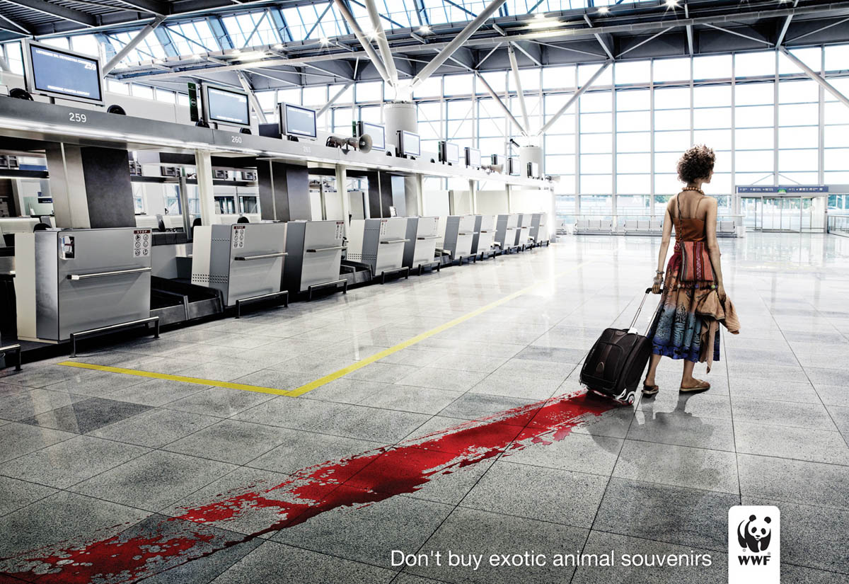
Form and Content Exercise 5
For this week’s form and content exercise I choose another WWF, World Wildlife Foundation print advertisement. I found this print advertisement on google. com when I searched for WWF print ads. The context that the ad presents is simple don’t spend your money on items that these endangered animals lost their lives for when you go on vacation. Even though you didn’t kill that animal, you payed the people who killed that animal and you payed the people that sold that product to you, so the blood is also on your hands. The connection between the content and the form is the text simply states don’t buy animal souvenirs on vacation. The photograph shows a woman who is coming back from vacation, clearly buying animal souvenirs, the product is in her suitcase, and the first thing you see when killing an animal is its blood, so that blood will always follow her. What makes this print advertisement visually interesting is I looked at the photograph and the blood and got confused until I read the bottom of the ad, “Don’t Buy Exotic Animal Souvenirs,” and I thought that, that was totally wrong. But the WWF did what they were set out to do, to shock the public, and to let the public know that this cruelty still exists, and is still going on today. The WWF wants people to help by, refusing to buy anything to do with animal products that those animals unwillingly gave their life for. In the ad there is really no balance it seems very left heavy. There is proportion in the ad, the airport is big in scale, and the person is small in scale, but there is depth of field, closer to the front of the ad everything is bigger but as you move forward in the ad the doors to the airport are small. In the ad there is evidence of rhythm, for example, the monitors, tiles on the floor, and the windows are in a continuous pattern. The type relates to the image by making it simple, just like the airport, there’s no one to be seen but the woman. Also the type catches the eye just like the blood on the floor.http://www.ibelieveinadv.com/commons/wwfblood.jpg
Subscribe to:
Posts (Atom)